These are some samples of my manual color separation work- all of this is done by hand in ADOBE PHOTOSHOP and took anywhere from 1-5 hours to accomplish. My aim is to always strive to get as close as possible to the original vision in my separations. After that it is up to the press and ink departments to help make that come to life.
Each design presented below is registered to its respective licensor/copyright holder. These are in no way my designs, I merely separated the files into printable 'plates' for garment decoration. Also, each design has been approved to print by it's respective licensor/copyright holder.
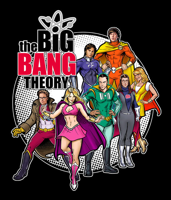
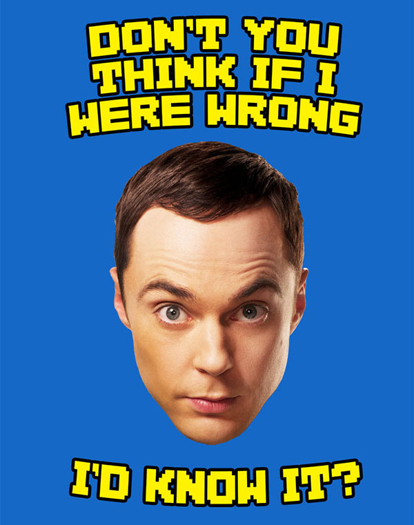
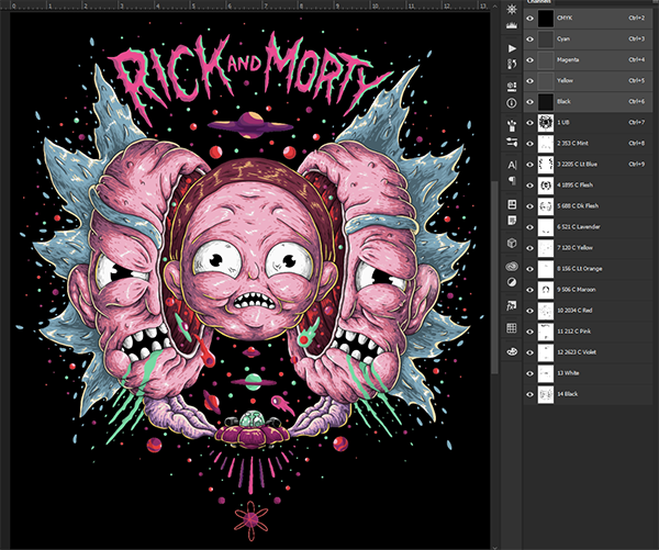
Original Source
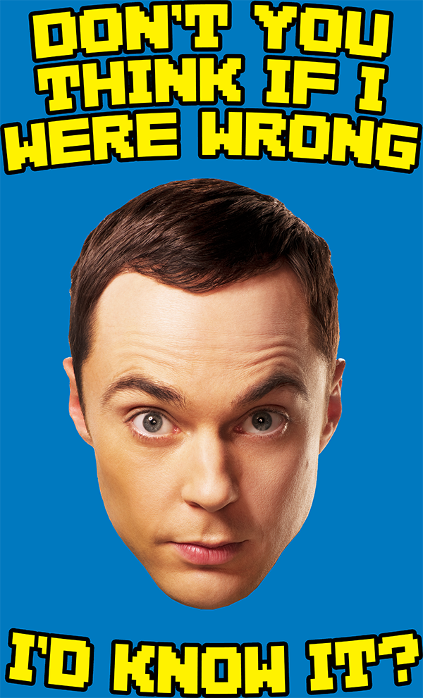
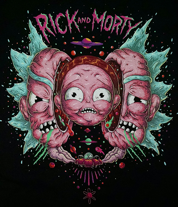
My separation composite
Final print
Manual separation for The Big Bang Theory #2

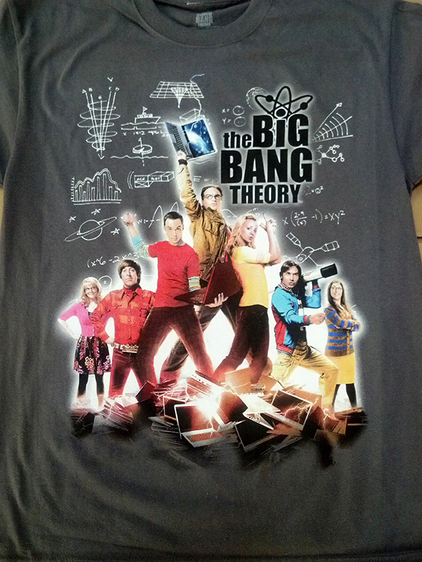
Original Source

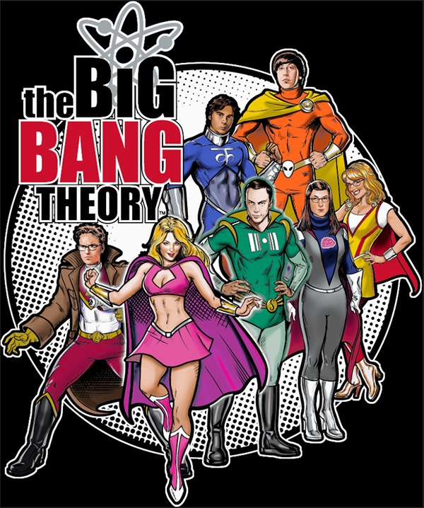
My separation composite
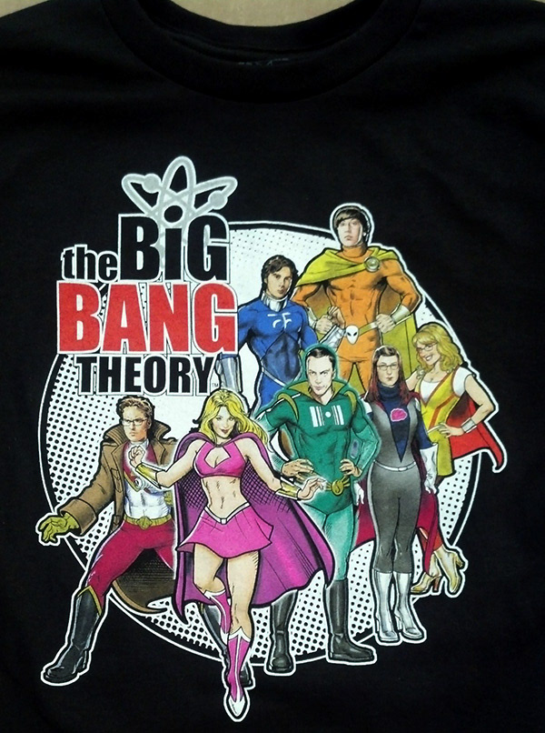
Final Print
Manual separation for The Big Bang Theory #3
Original source
My separation composite

Final Print
The left eye bugs me a bit too because they had me brighten it up a bit, which to me makes it look unnatural.
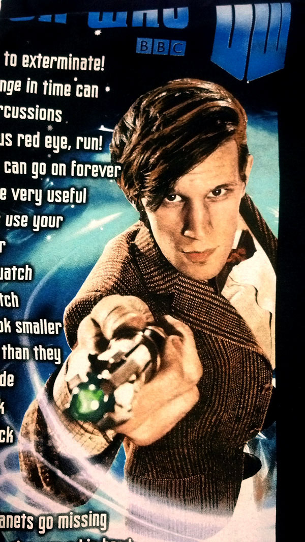
Manual separation for Dr. Who
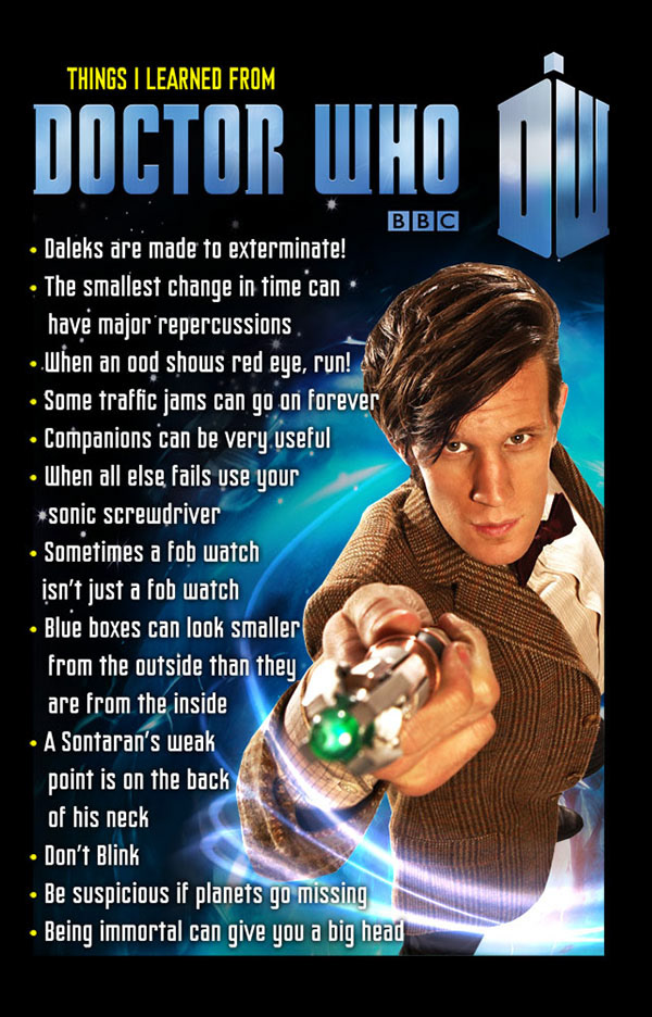
Original Source
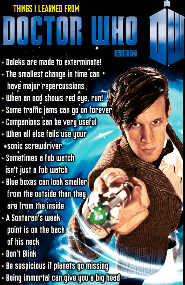
My separation composite
Final Print - note on this one, the color seems off from the source because the BBC didn't like the first run and had us change the color to what you see here. The original source file had the wrong color profile.
Manual separation for American Horror Story
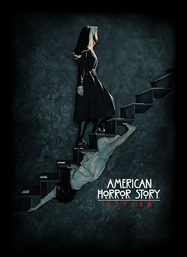
Original Source
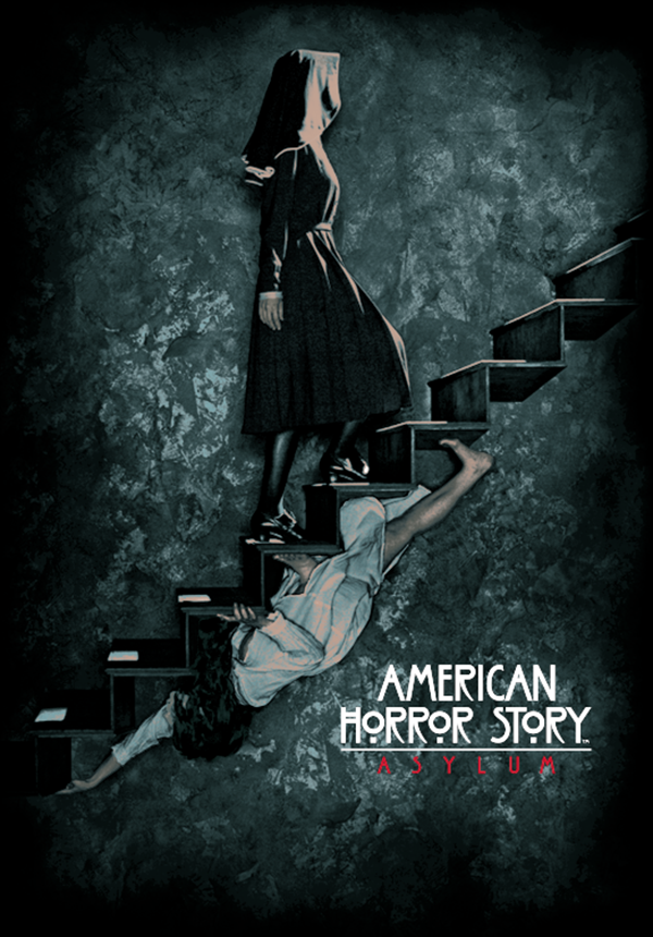
My separation composite
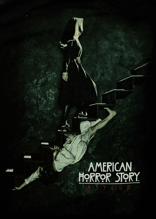
Final Print - we removed much of the underbase, which is what makes it bright, per the request of the client
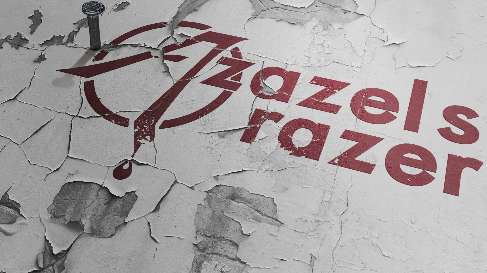
Manual separation for Swamp People
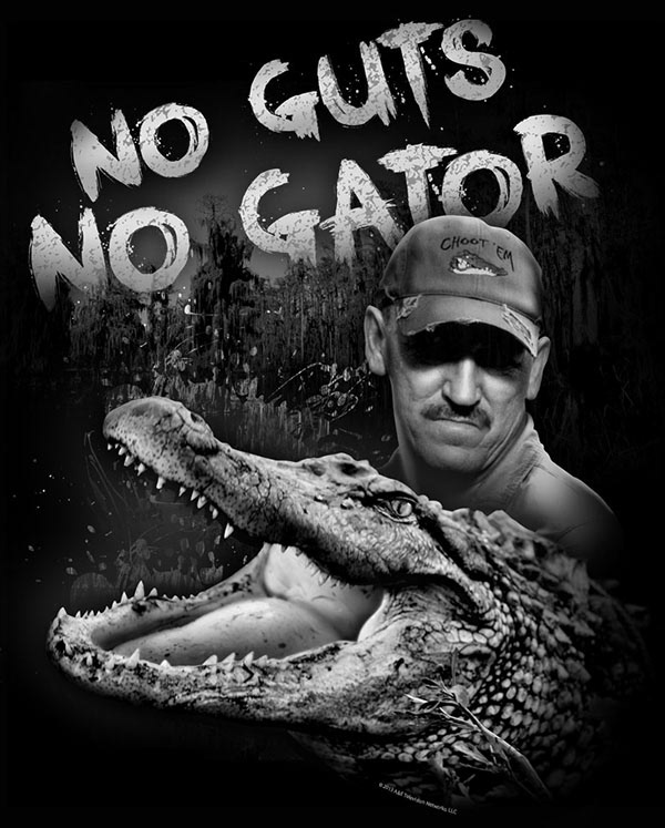
Original Source
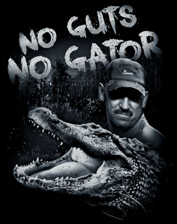
My separation composite
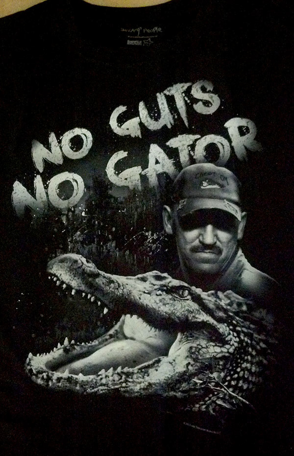
Final Print

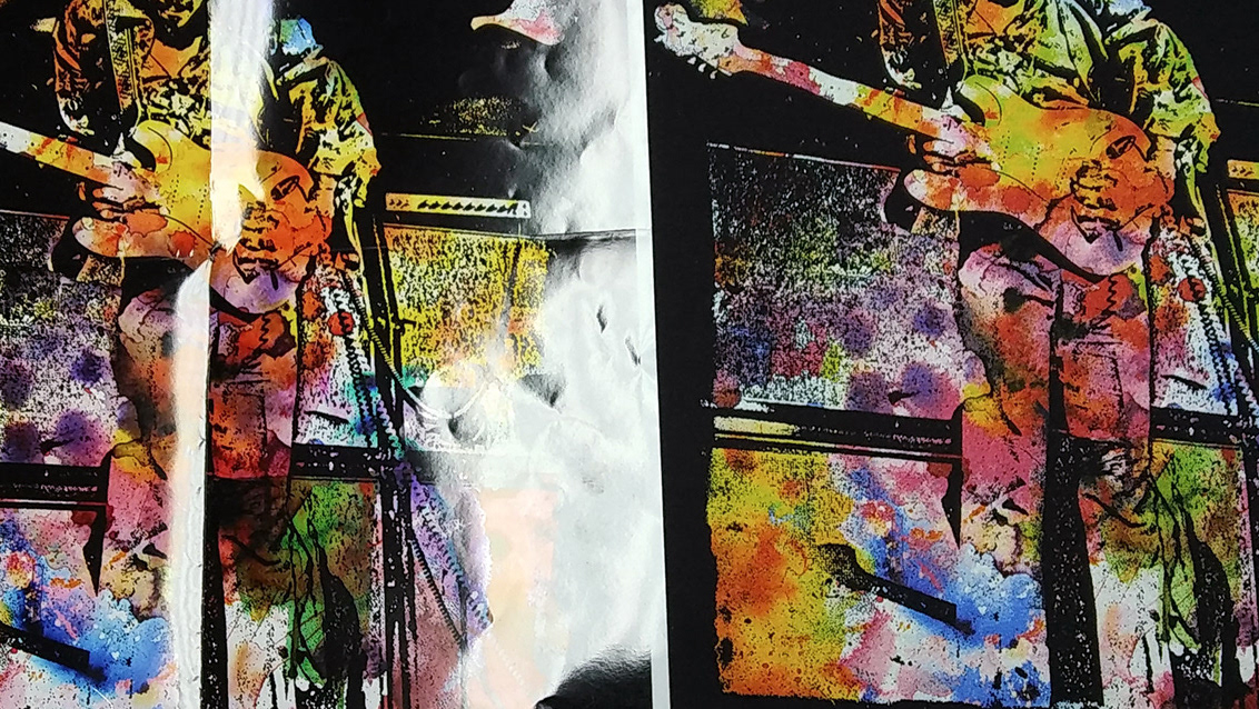
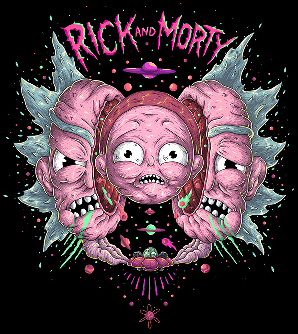
Original Source

My Separation Composite

Final Print
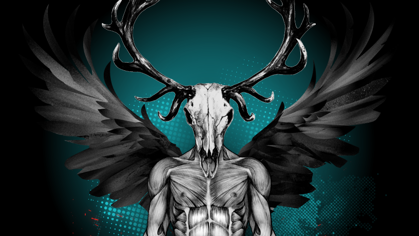
THE QUALITY OF THE SOURCE FILE WAS QUITE POOR, BUT I WAS ABLE TO BRING OUT THE SUBSTANCE OF THE DESIGN
SOURCE FILE
separation composite.
FINAL PRINT